Shupla
Info
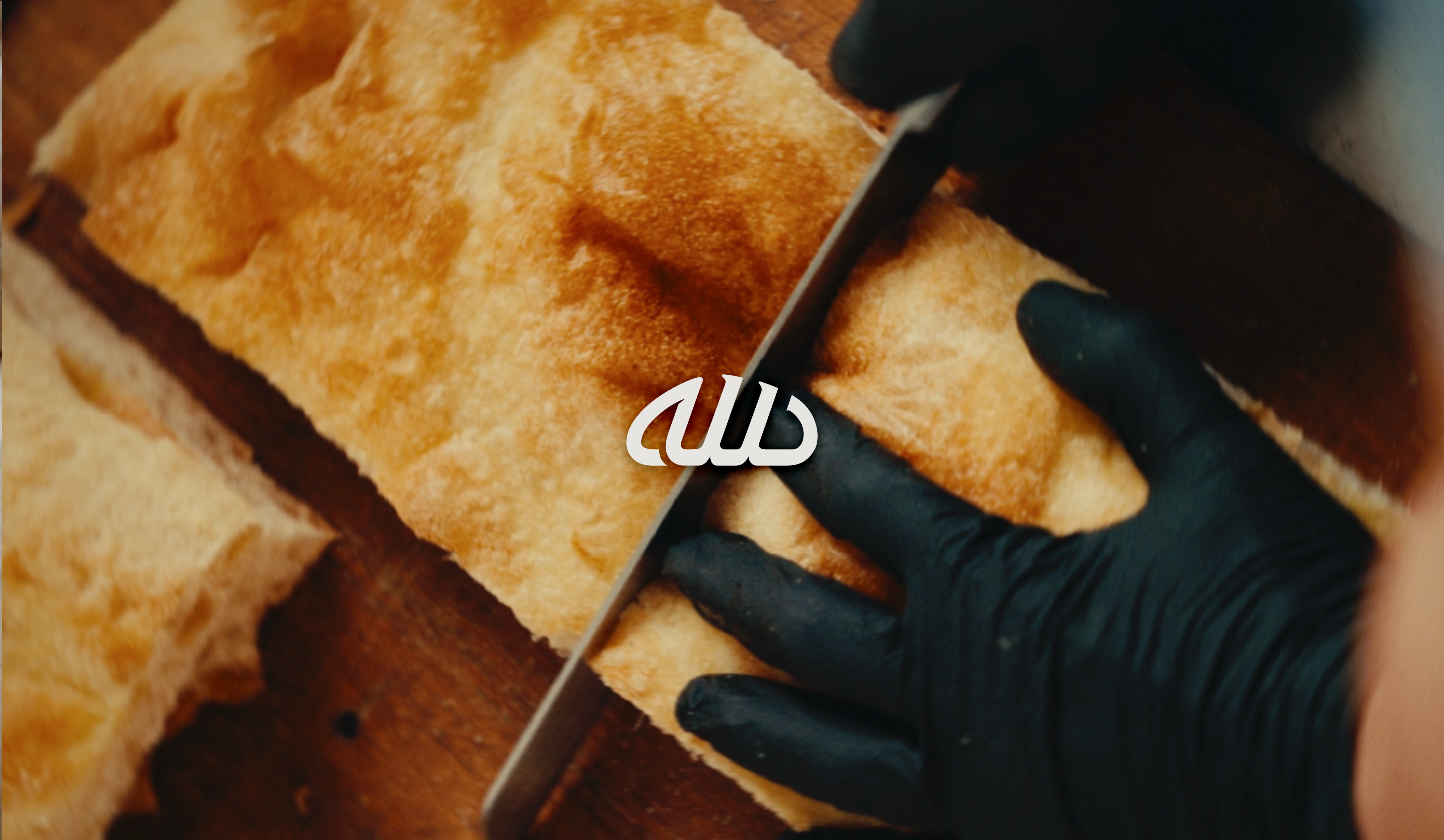
Some briefs arrive with the concept already inside them. ШУПЛА is an old Bulgarian word for the air pockets inside well-made bread — the ones that only appear when the process is right. It's a name that earns attention before the logo exists. The challenge wasn't finding the idea. It was building a visual language specific enough to hold it. The brand direction landed on "The Anatomy of Bread" — graphic, high-contrast, and raw. A system built around blacks, oranges, and greys. Treated sans-serif and monospaced type. Texture used with intention, not decoration. The goal was an identity as precise and ownable as the name itself — one that sits clearly apart from the saturated visual codes of the modern sourdough café, without trying to look like it belongs somewhere else. The space is still being set up. The identity is ready.
Year
2026
Client
Shupla
Services
Specialty Bakery & Brunch